


For those who are new to the realms of trading or investing, deciphering charts can appear quite intimidating. Certain individuals may lean on their instincts, shaping their investment decisions around intuition. While this approach may yield temporary success during bullish market conditions, its efficacy is doubtful in the grand scheme.
Fundamentally, both trading and investing hinge on the principles of probabilities and effective risk management. Thus, acquiring the skill to interpret candlestick charts proves indispensable across virtually all investment styles. This article aims to demystify the concept of candlestick charts and provide guidance on comprehending them.
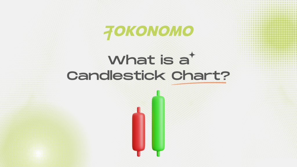
What is a Candlestick Chart?
A candlestick chart serves as a financial chart that visually depicts the price movements of a given asset within a specified timeframe. Comprising candlesticks, with each symbolizing an equivalent time duration, these charts have the flexibility to represent diverse periods, ranging from seconds to several years.
The historical origins of candlestick charts trace back to the 17th century, with their development as a charting instrument often attributed to Homma, a Japanese rice trader. Homma’s concepts form the bedrock of the contemporary candlestick chart, further refined by influential figures like Charles Dow, a key contributor to modern technical analysis.
While candlestick charts can be applied to analyze various forms of data, their predominant utilization lies in facilitating the examination of financial markets. When utilized accurately, these charts become invaluable tools enabling traders to assess the likelihood of price movement outcomes. Their utility extends to empowering traders and investors to formulate individual insights based on their market analysis.
How do Candlestick Charts Work?
The essential price points required for the formation of each candlestick include:
- Opening Price (Open) — Denoting the initial recorded trading value of the asset during the specified timeframe.
- Highest Price (High) — Representing the utmost recorded trading value of the asset within the given timeframe.
- Lowest Price (Low) — Indicating the minimum recorded trading value of the asset within the specified timeframe.
- Closing Price (Close) — Reflecting the concluding recorded trading value of the asset within that particular timeframe.
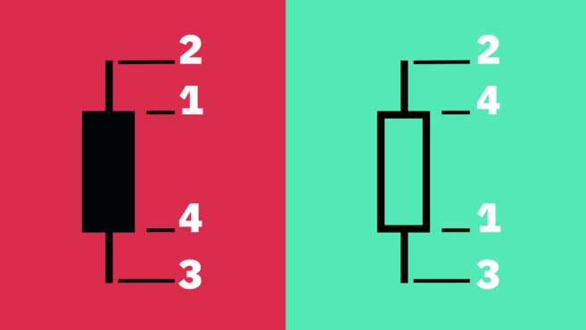
This dataset is referred to as OHLC values. The candlestick’s configuration depends on the interplay of open, high, low, and close.
The gap between open and close is the body, while the space between the body and high/low is the wick or shadow.
How to Read Candlestick Charts
Candlestick charts are often preferred by many traders for their user-friendly nature, despite providing similar information as bar and line charts. These charts allow for quick comprehension, presenting a straightforward illustration of price movements.
In practical terms, each candlestick serves as a visual depiction of the ongoing battle between bullish and bearish forces within a specific timeframe. Generally, a lengthier candle body signifies heightened buying or selling pressure throughout the measured period. Short wicks on the candle imply that the high or low of the timeframe is closely aligned with the closing price.
The coloration and configurations might exhibit variations across diverse charting tools; nonetheless, a prevailing convention is that a green body indicates a closing price higher than the opening, while a red body signifies a downward price movement, indicating that the closing price was lower than the opening.
Chartists may opt for a monochromatic approach, utilizing black-and-white representations. In this alternative scheme, upward movements are denoted by hollow candles, while downward movements are depicted with black candles.
What Candlestick Charts Fail to Reveal
While candlestick analysis proves valuable in offering a broad overview of price movements, it might fall short of providing a thorough examination of market dynamics. One limitation lies in the fact that candlesticks elucidate the distance between opening and closing prices but lack a detailed account of the events occurring within that time frame.
To elaborate, the intricate details of the sequence of events between the opening and closing points remain obscured within the candlestick representation. Although the wicks of a candlestick indicate the period’s high and low, they fail to establish the chronological order of these occurrences. Nevertheless, within most charting tools, the ability to adjust the timeframe permits traders to delve into shorter intervals for a more nuanced analysis.
Furthermore, candlestick charts, particularly on lower timeframes, may introduce considerable market noise, adding a layer of complexity. The rapid alterations in candle formations present challenges in deciphering their implications, contributing to potential difficulties in interpretation for traders.
Heikin-Ashi Candlesticks
Thus far, we have delved into the Japanese candlestick chart, but it’s crucial to note that various methods exist for computing candlesticks. One such technique is the Heikin-Ashi Technique.
The term “Heikin-Ashi” translates to “average bar” in Japanese. This method of presenting candlestick charts involves a modified formula utilizing average price data. The primary objective is to smoothen price action and eliminate market noise, enabling the easier identification of market trends, price patterns, and potential reversals.
Traders frequently combine Heikin-Ashi candles with Japanese candlesticks to mitigate false signals and enhance the likelihood of recognizing market trends. Green Heikin-Ashi candles without lower wicks signal robust uptrends, while red candles without upper wicks indicate strong downtrends.
Although Heikin-Ashi candlesticks can be a potent tool, similar to any other technical analysis technique, they do come with limitations. Due to their reliance on averaged price data, patterns may take an extended period to manifest. Additionally, these candles do not depict price gaps and might obscure other essential price data.
Conclusion
Candlestick charts stand out as an indispensable tool for traders and investors, serving as a cornerstone for market analysis. Beyond their role in visually illustrating price movements for a particular asset, these charts grant traders the versatility to scrutinize data across various timeframes.
Delving into a comprehensive exploration of candlestick charts and patterns, coupled with cultivating an analytical mindset and dedicated practice, can potentially equip traders with a competitive advantage in the market. Nevertheless, the consensus among most traders and investors is that it remains crucial to factor in other methodologies, including the indispensable practice of fundamental analysis.